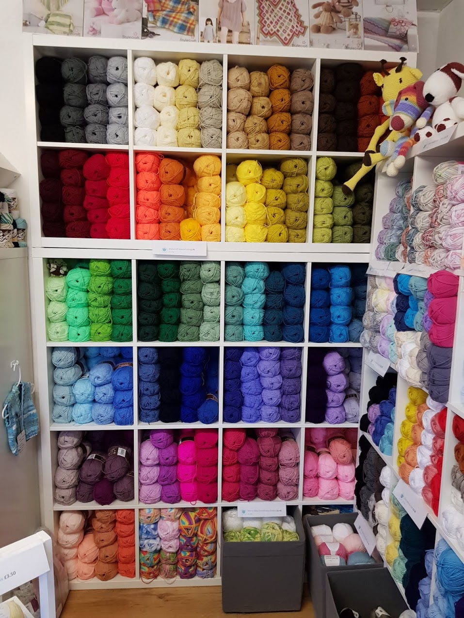
How does anyone know which colour combinations work? Who's to say that you can't put certain colours together? Who actually gets offended if shades are mismatched? Surely there are worse things in this world than an apparently offensive colour combo?
But when looking at a new outfit, decor or homeware item we are really rather particular about what is and isn't acceptable. How much of what we like is actual personal preference and how much is down to current trends? It makes you wonder.
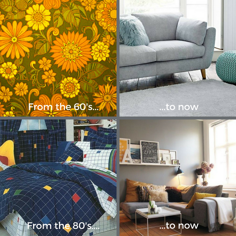
Take home decor and furnishings for example, these days we tend to favour neutral tones with accents of tasteful shades such as duck egg and mustard, whereas a few decades ago tastes were very different. In the 1960's homes were smothered in heavy prints and floral designs in browns, oranges and yellows, only to make way for simple lines and geometric shapes in primary colours and white in the '80's. Then came the sheer excitement of the magnolia age at the turn of the 21st century.
So when it comes to new blanket patterns, how do these talented designers decide on their colourways? I'm guessing many factors are taken into consideration; name of design, initial inspiration, current trends, personal preference, etc. Well that's pretty much my criteria anyway.
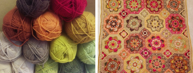
That's how the incredibly popular In Awe of Autumn version of the Persian Tiles blanket came about. I wanted to create an autumnal-feel with just a hint of Victorian Christmas that would be subtle enough to fit into a traditional living room but still bring the wow-factor with the combination of the rather bold shades.
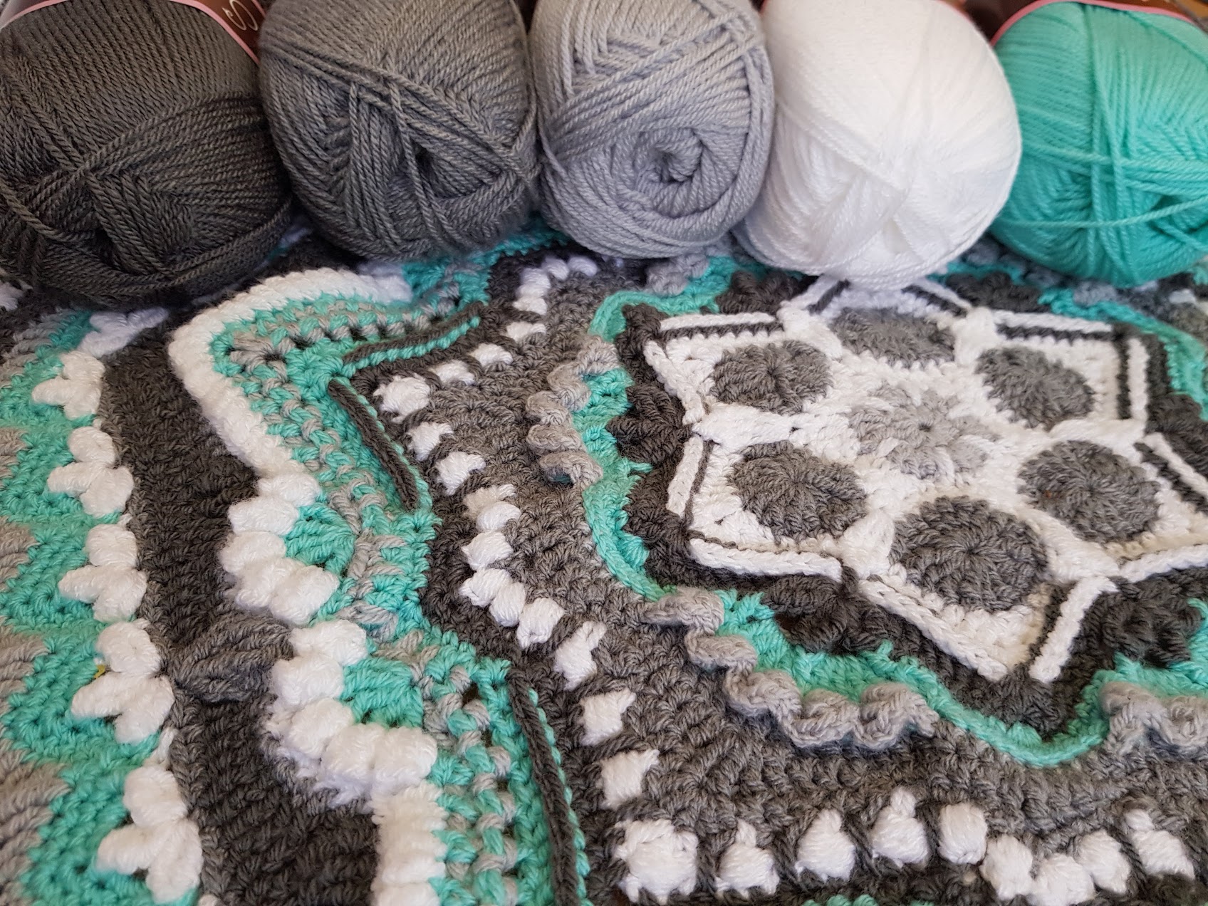
More recently I have put together the striking Woolfull colourway for the Cosmic CAL using monochromatic tones teamed with a vibrant minty blue-green. The more observant amongst you may recognise this as our shop colours!
I often get asked, both in the shop and online, to help select colourways for customers which is something I absolutely love to do. The conversation generally goes something like this:
- "Please can you design a colourway for a blanket I want to make?"
- "Of course, do you have any particular shades in mind?"
- "Well I do quite like pink".
A great starting point for sure, but there are so many variations of 'pink' to choose from, so we need to refine our options a little. There are bluey pinks, red-pinks, salmony pinks, neon pinks, baby pinks, creamy-based pinks. It can be a little overwhelming, especially with so much choice in yarn colours these days, so it's no surprise we get asked time and time again to help customers out with what goes with what.
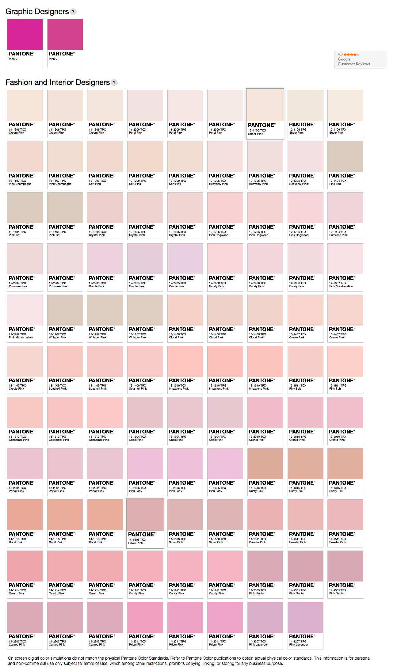
A good place to start is by choosing a definite specific shade you must have in your work. Then look at what type of shade it is, for example, is it a bright, a pastel, a bluey-base or a creamy-base? Once that's established it's much easier to see what looks good with it, and what doesn't.
So if your main shade was Clematis, a bluey-based pink, you'd probably want to add other cool bluey-based shades like Sherbet, Silver and Wisteria. Whereas if your must-have shade was Raspberry, a creamy-based pink, you'd be more likely to settle on other creamy-based shades such as Duck Egg, Cream and Mushroom to give a warmer blend.

To me, colour matching isn't so much a science but a gut feeling, an instinct. The wrong set of shades together can jar or clash. Whereas the right combination makes for a more cohesive match that works beautifully together and just seems to fit. Whether they are what you consider attractive colours or not the end result will make sense and be pleasing to the eye.
On the other hand, there is a lot to be said for 'colours that make us happy'. For some, that may be blues, teals and soft yellows evoking childhood memories of the days spent at the beach, or earthy browns, greens, oranges and yellows reminiscent of shady woodland strolls on a summers day. For others, their happy colours may include random blends of purples, blues and greens, or the calming neutral tones of creams, taupes and soft greys. For me, one of my favourite feel-good combos is a mix of clashing hot pinks, firey reds and vivid oranges which reminds me of bouquets of beautiful gerberas.

Mood boards can be a great asset in helping you decide on a new colourway. Just grab samples of the shades in the room the blanket will be going in and match them up to the yarn. It's that straightforward really. However, it is prudent to exercise a little caution if using an already made mood board. Yes the colours may be pretty and the picture might be reminiscent of a tropical beach you dream of visiting one day, but will those shades work with your decor at home?
But whatever colour palette you choose, and no matter how you come to your decision, it has to be right for you. It makes no difference what anyone else thinks of your taste in colours. It's your project, your taste, your personality. Enjoy your own personal world of colour!
Debbie
